The Oriental Trading Company items shown below were provided by them to facilitate this post. As always, all opinions expressed here are entirely my own.

Many of you already know that I highly recommend David Zyla’s The Color of Style. (Or Color Your Style; they’re the same book.) The book walks you through, step-by-step, the process of selecting your own best colors. But once you’ve selected those colors, how do you keep them close at hand for reference when you need to buy something? That’s what we’re going to talk about today — along with a possibly-surprising fashion resource.
Some Options
There are a number of options for the physical creation of a personal palette. As he walks you through the process of color selection, Mr. Zyla mentions various cosmetics. You could just leave it that — keeping a cosmetics kit of essence-colored foundation, romantic-colored lipstick, dramatic-colored eyeshadow, etc. But personally, while I think those things are good to have, I find that a clunky way to carry around the colors for reference.
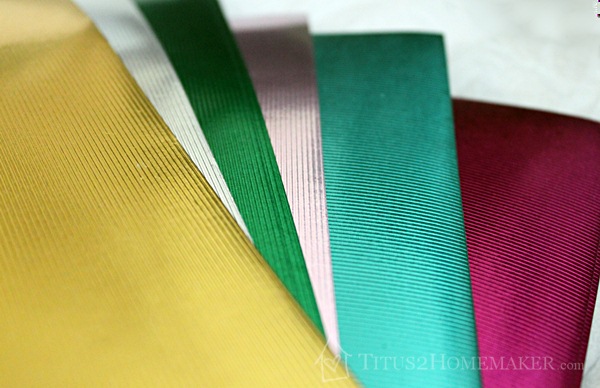
Fabric is another option. Or embroidery floss. Or paint.
Really anything that comes in a large selection of colors could be used to create a palette. But an easy material for most people to both find and manipulate — and, actually, what Mr. Zyla himself uses — is paint chips.
(Ethics note: We’ve purchased a lot of paint, so I don’t have any qualms about taking a modest selection of paint chips from the place that sold us our paint. But if you haven’t/aren’t purchasing paint, or you plan to obtain a large number of swatches, you might want to purchase paint chips instead. Do keep in mind that you can generally take more than you need initially, so you can compare them in good lighting, and return the ones that aren’t right.)
Putting it Together
When it comes to putting the palette together, you still have options. You could cut out tiny swatches and adhere them all to a single card. (I’m making tiny ones like this for my other family members, for when I shop for them. Approximately half-inch squares glued to an index card, folded in half. This way I can pencil in their measurements and/or sizes, too.) You could keep the cards just as they are. You could cut them to business card size and put them in business card sleeves. Or you can do what I did and purchase Chicago screws to make an actual “fan”-style palette.
Adding the Fun Stuff
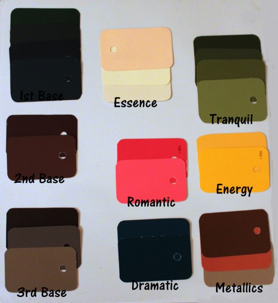
The book talks about eight colors (three neutrals and five “color-colors”): essence, romantic, dramatic, energy, & tranquil colors, and first, second, & third bases. One category the book does not mention (I assume because there’s not a nice, neat way to describe how Mr. Zyla chooses the “colors” in this category) that folks who have seen “the man” himself are given as part of their palettes, is metallics.
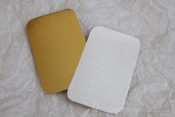
Metallics are a fun thing to include in your palette, but we need to have some guidelines for selecting them, and we need a way to portray them. This is where my surprising source comes in. Oriental Trading Company has some amazing metallic paper packs that are great source material for the metallics in a palette. (You can try “scrounging” metallics, from Christmas cards and such, but that could take a while! It’s much easier to have them all in one place. The ones above are actually paint chips, too, but the options for those are very limited.)
[UPDATE: The paper packs I purchased back when this post was originally written are no longer available. You can see what Oriental Trading currently has available by doing a search, or look for metallic cardstock at Amazon, Michael’s, Hobby Lobby, Scrapbook.com, etc.]
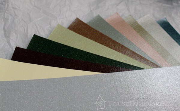
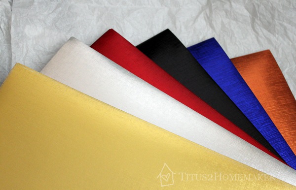
Aren’t they gorgeous?! (Just a heads-up: the glittery ones stink. Literally, I mean. I think there’s some kind of vinyl coating or something that keeps the glitter from falling off.) As you can see, the foil papers have two different textures. And there’s a broad range of colors here. Not all of these colors will be good for every individual (obviously).
So…a few tips for choosing metallics:
1) If there’s a metallic version of a “regular” color in your palette, it’s probably good. Bronze and (rosy) copper are both good for me, because they mimic the brown and brick already in my palette.
2) If you’re high-contrast and/or bright, shiny metals are probably good for you. For the rest of us, matte is generally better.
3) If you’re cool-toned, gold is probably not a good choice; if you’re warm-toned, silver is probably not a good choice. (If you’re more neutral, it’s a bit trickier to tell.)
4) Consider the depth. If you’re not light and you’re not high-contrast, there’s a good chance that something deeper — like brass or bronze — would be better than something lighter — like a bright gold. Or pewter than silver.
5) If texture is your friend, matte or textured metals are probably better than shiny ones. If sleekness and “clean lines” are your friend, try smooth/shiny.
See that blue at the far right of the upper photo (the glittered papers)? That’s probably an excellent metal for my daughter, Ariel. It’s not too shiny (which would be too high-contrast for her), and the color is almost identical to a grey-blue in her palette that matches her eyes.
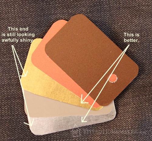
The foils in the middle picture are an excellent texture for me. But they’re a bit too shiny.
I tried “dulling them down” by rubbing black paint onto them and then back off, with limited success. (It has to do with the surface of the paper, I think.) Here’s what my metallics look like with the dulled-down versions of the gold and silver added:
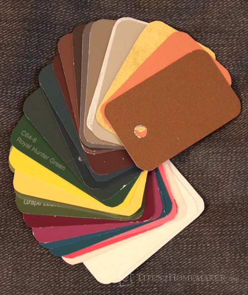
And an overall look at the palette:
But Wait…There’s More!
Oriental Trading Company is an excellent source for a selection of metallic papers for adding to fans. (Or prints. You could use printed scrapbook papers in a similar manner.)
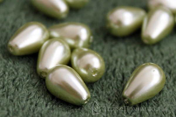
But that’s not the only way they can serve as a fashion resource! Did you know they sell jewelry-making supplies? Yep. Including a pretty wide selection of beads. Check these out.
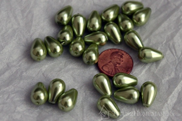
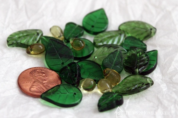
(Obviously, the penny doesn’t come with the beads. I just wanted to give you a better idea of their scale.)
I was hoping they’d be a good match to my “tranquil” color. As it turns out, the drop-style beads are a bit light/clear for that. (That happens sometimes with online shopping – you figure they’re close and know that some things just won’t be quite right; be sure there’s a good return policy if you’re buying something more expensive, like clothing!) They’re probably a good color for my sister, though.
But some of these leaf beads are perfect. See how some of them are just blending right into my scarf (previously matched to the tranquil color I’ve chosen, and shininess aside, of course)?
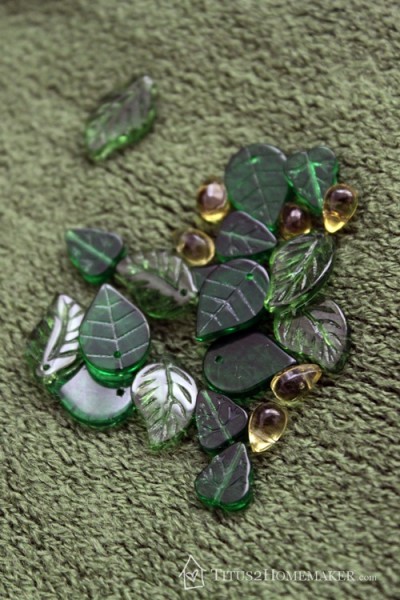
Leaves are a favorite motif for me, too, so I was especially excited about these.
So what do you think? Would you consider creating a personalized palette for yourself? Which beads are your favorites?
Leave a Reply