
Well, there’s nothing like starting a new I’m-going-to-blog-every-day-for-a-month series, and getting lots of new review items in the mail, to ensure that a stomach bug makes its way through the house and pushes you hopelessly behind. Whoever Murphy is, someone ought to repeal his law. 😉
Anyhoo…so I am way behind and will do my best to go back and “fill in” the days that I missed (I had posts planned for those days, just not written yet), but I’m going to start by trying to get the current ones up and going. Starting with my DIY Day Planner.
DIY Day Planner
There were a number of factors that went into my deciding to set this up this way: the desire for it to be small and compact; the desire for flexibility; the “boringness” of the spiral-bound Day-Timer options (which I’ve been successfully using for a number of years now, but wanted something a little more “fun”), an introduction to the idea of “bullet journaling,” and seeing how graph paper as a background makes it simple to “build” a variety of pages, even without fancy templates and such. ‘Cause even if you can’t draw a straight line, this way you can follow one, and you don’t have to measure, etc.
Problem is, the graph paper you can buy is too dark. It’s distracting. So I made my own.
The Parts & Pieces
Now, the nice thing about this is that you can create whatever pages you want. But here are the primary elements I wanted in mine:
- Daily pages – with plenty of space for appointments, notes, and a little template I hope to add later that will let me quickly check off my social media shares (for the blog)
- Monthly pages
- Year-at-glance
- Blank graph pages for bullet journaling/list-making, general notes, and the like
- An indexing system for major topics
- And the ability to add or remove things
The Method
The way I decided to accomplish the adding/removing and the compactness issue is to use my comb-binding machine. This means I’m not taking things out and replacing them on a daily basis – that would be too much trouble. But I can put in just a month’s worth of daily pages at a time and swap those out later. I can add pages for my to-do lists and periodically swap them out for fresh ones. You get the idea.
It’s not really finished. I want to add some tabs and such, but it’s my plan to “live with it” for a while and tweak it to my liking before I do anything as “all-out” as tabs. Here I’m going to show you what the pages look like, and then tomorrow and the next day I’ll share some individual elements.
Take a Peek
This is the yearly overview. As you can see, it folds in, so it can be set up on a full sheet of paper. I saw this layout at Ahhh Design (well, hers was with the months across the top, but it’s the same idea) and liked the way the days of the week are lined up. I figured it would be even easier to create on graph paper. It’s a little tedious writing it all out, but it’s not too bad (and it only has to be done once a year!).

Then here’s a month. It’s also designed to fold it. I suppose I could have designed it as a two-page thing instead, but this has some interesting benefits – like being able to write on the outside of the fold. (I plan to put my monthly goals on there, but I haven’t managed to get that caught up on life yet. October’s goals are still scribbled on scratch paper somewhere, where I drafted them.)
There are pros and cons either way. When it folds out like this, it’s a little tricky to write on some parts of the calendar, where it would probably be easier to write on if it were just two regular pages. But I kind of like having it not broken up in the middle. (It was my intent to have some fun with decorating the month names, too, which is why it’s that funky neutral color. I stamped that as something of a “template” to decorate. But again with wanting to tweak it and make sure all the pieces are working for me before I invest too much time.)

Here’s a daily spread. Eventually, I might devise a template for the right side of the spread, too. For now…you guessed it — I want to see what’s working. I figure that once I get a feel for what I’m writing in regularly and how I use the space, I can block that off if I need to.

You probably can’t see it very well in the image above, but there are hours in the box at the bottom-left. Here’s a close-up so you can see them better. They’re light on purpose, so you can trace over the ones you need but have blank sections (particularly at the top and bottom) if you aren’t using them.
The times go from 1 a.m. all the way through midnight, so this would work even if you’re doing a weird shift or something. But I’m pretty much never going to use anything earlier than 7-ish (in the morning), which just leaves some extra space at the top of that box that can be used for another purpose – like to make a note of the weather or something.

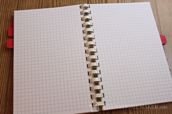
Most of the book that isn’t calendar space is “blank” pages like this. It can easily be used for bullet-style journaling (like my to-do lists), and is easy to write on, draw on, or block out as necessary because the graph paper gives guidelines.
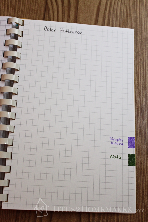
This is the color guide. If I’ve taken notes about something major on a given day’s spread, I can color in a couple squares at the right edge of the page. The color and location of the squares matches up to this back here. So I can flip through and check just the edges of the page to find something more quickly, and this guide page helps me remember what’s what.
(This was not my original idea, either, but I can’t remember now where I saw it.)
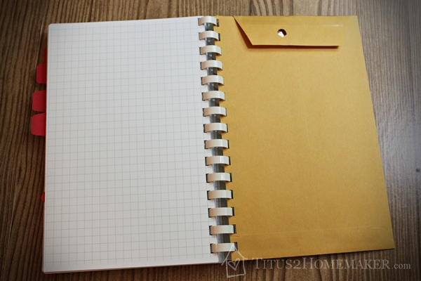
I haven’t used it yet, but I bound a manila envelope into the back of the book, too, so I’d have someplace I could tuck business cards, receipts, etc. that I may theoretically accumulate while out and about. (As I usually have my wallet with me when I’m out with my planner, I usually just tuck them there, but just in case.)
Pin It:
[…] In the last post, I gave you an overview of my DIY planner. In this post, I’m going to delve a little deeper into the graph background and the daily pages. […]